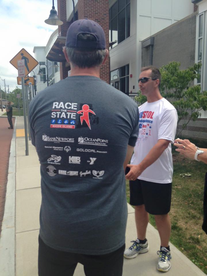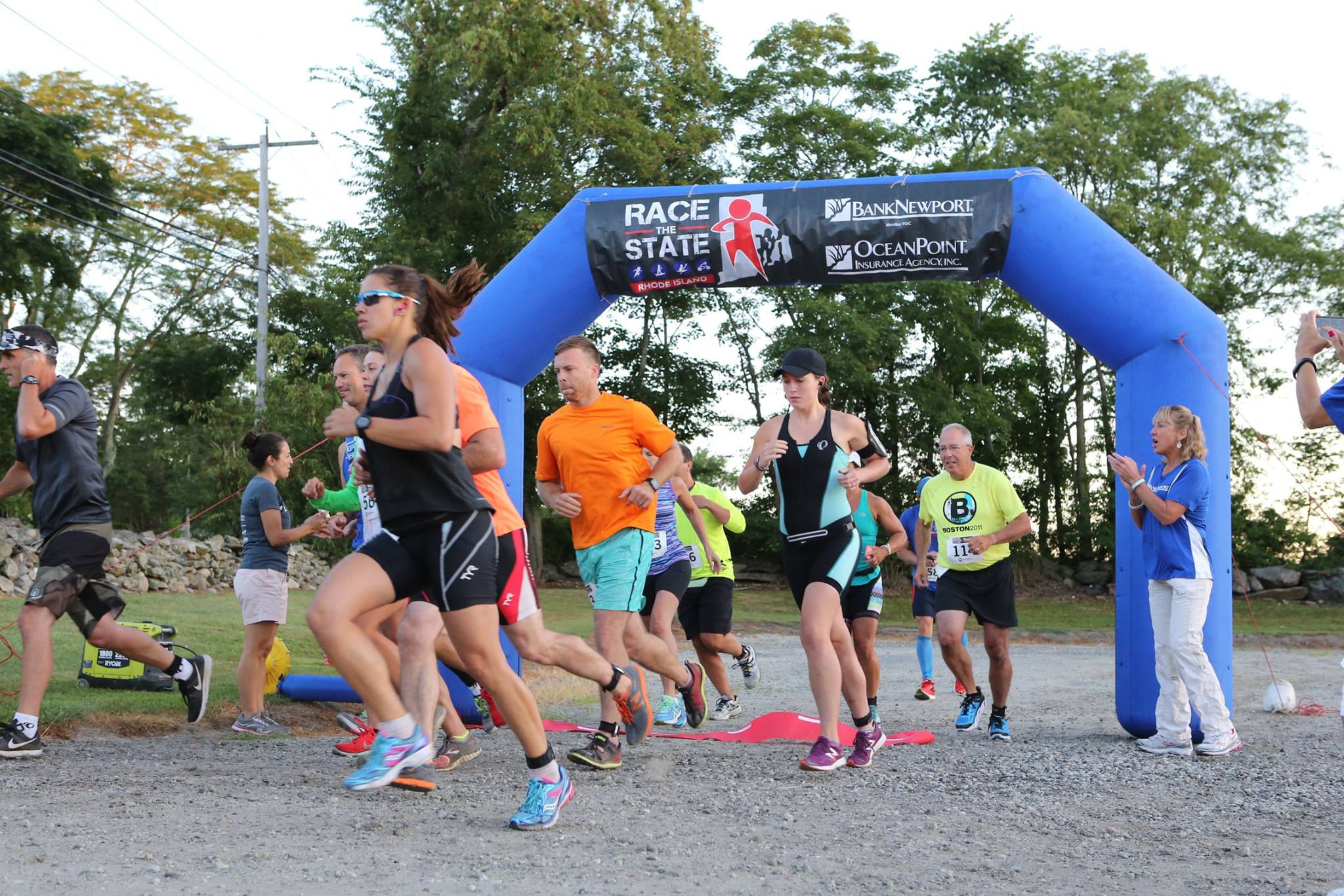


During my internship with Manuka Sports Management I was asked to develop a brand for a new race that would span from the edge of Little Compton to Westerly, Rhode Island. This race would include four different activities including rowing, bicycling, paddling and running. This new race was titled Race the State.
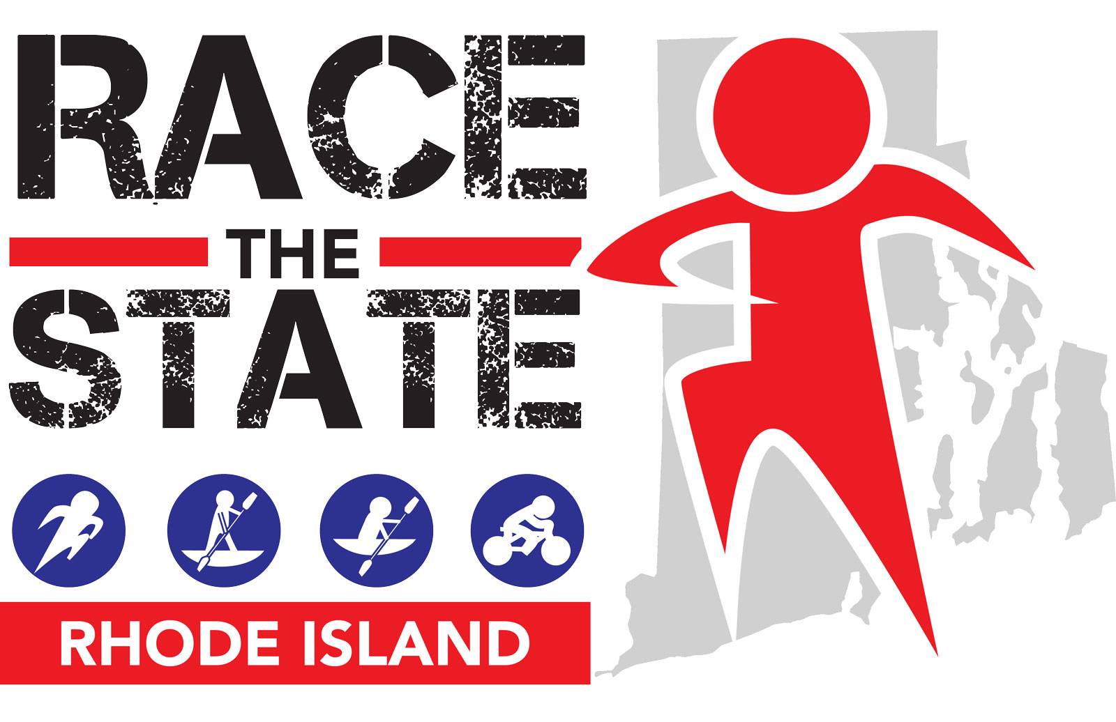
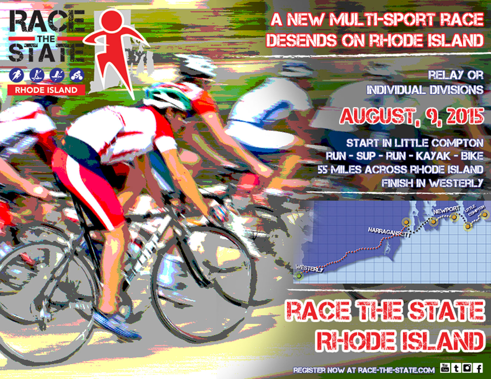
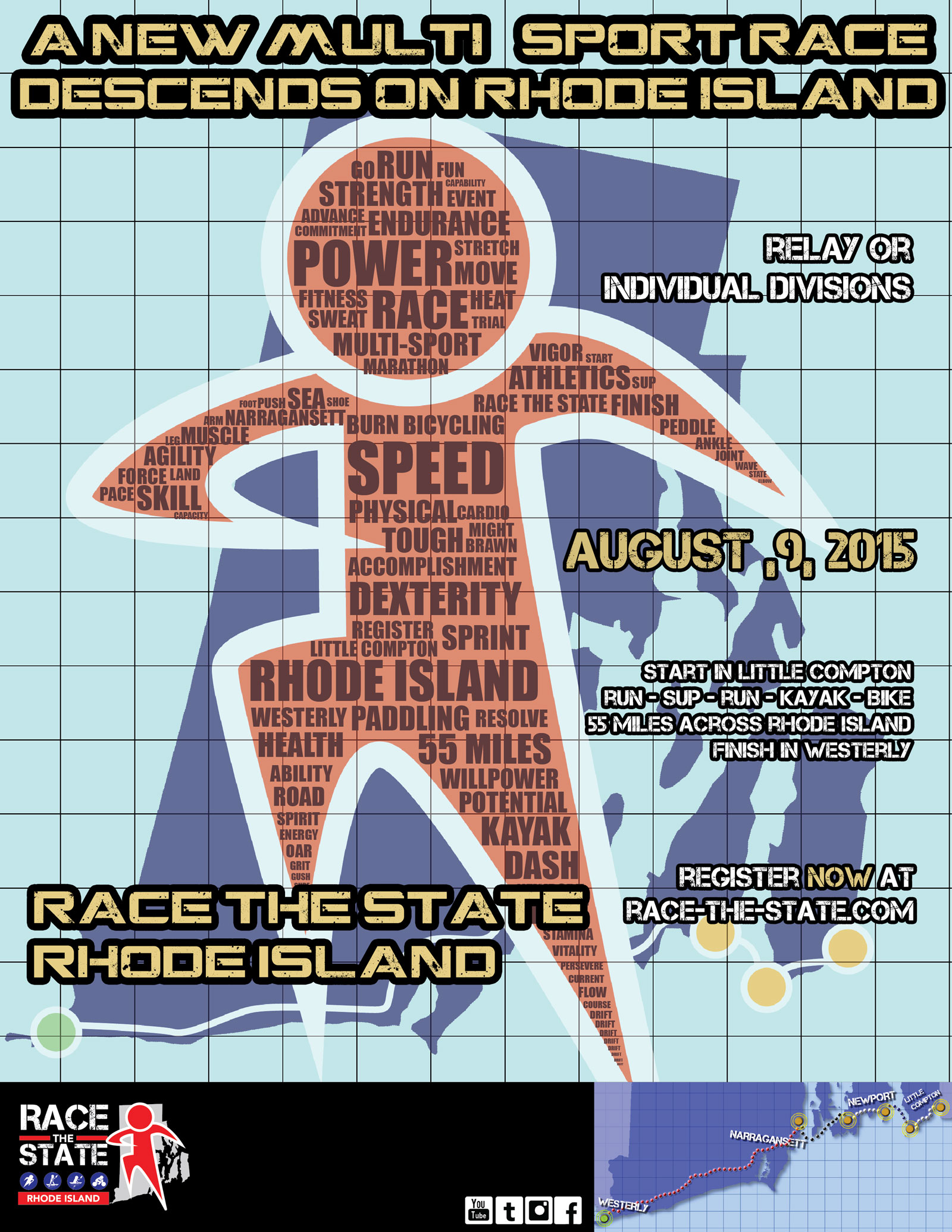
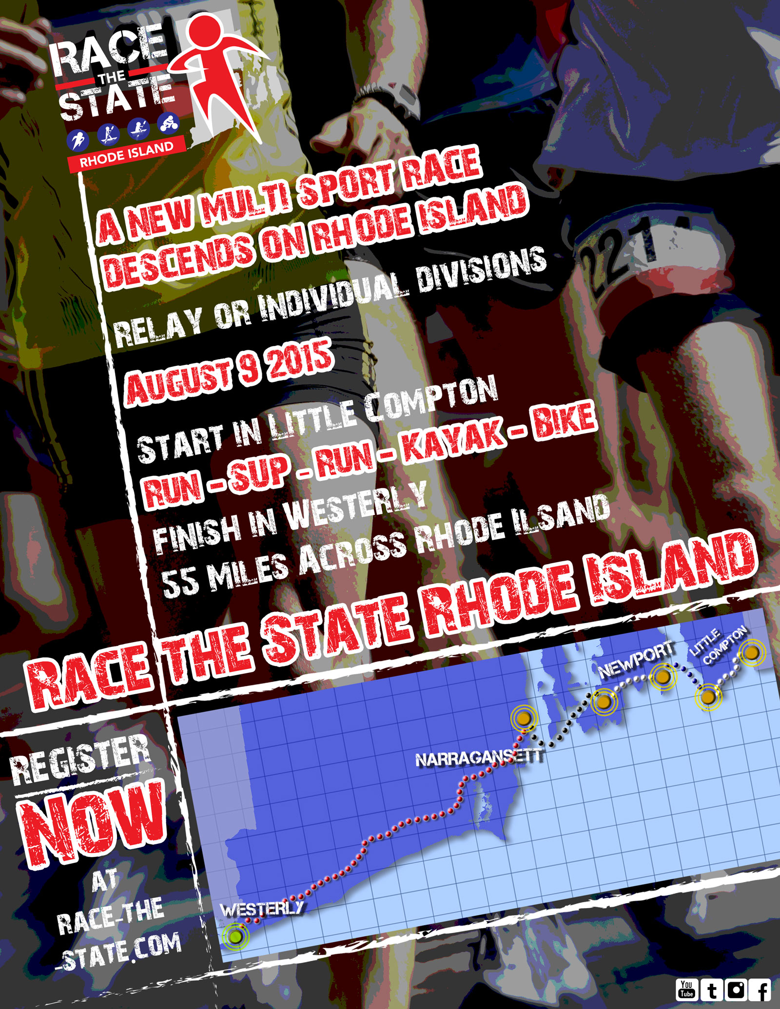
The project managers at Manuka wanted to incorporate a rough feel to reflect how tough the race really is. This led me to incorporate the Capture It font because of it’s bold visual and mix of white space ressembling cement to give the text a gritty display. I also wanted to include images of the sports activities that take place during the race which led to the adding icons of kayaking, paddling, running and bicycling. After the development of the logo I was asked to create posters to build awareness for the race.
I used the visual of the person running for viewers to make a personal connection and then laid it over the state of Rhode Island in order to show how big the challenge is. What was really important about this logo was the viewer making a personal connection. By doing this it gave viewers a motivation to try and complete this race.
If you’d like to register to take part in Race the State or find out more about it click the link here