
The Barnstable launches marketing campaigns dedicated to bringing the companies mission to new and dedicated customers. While working with North Star Marketing I had the opportunity to work on one of these campaigns. For this project I was to collaborate with a team developing marketing resources to better inform customers about the benefits of The Barnstable. The marketing collateral included mailers, print ads, brochures and more.

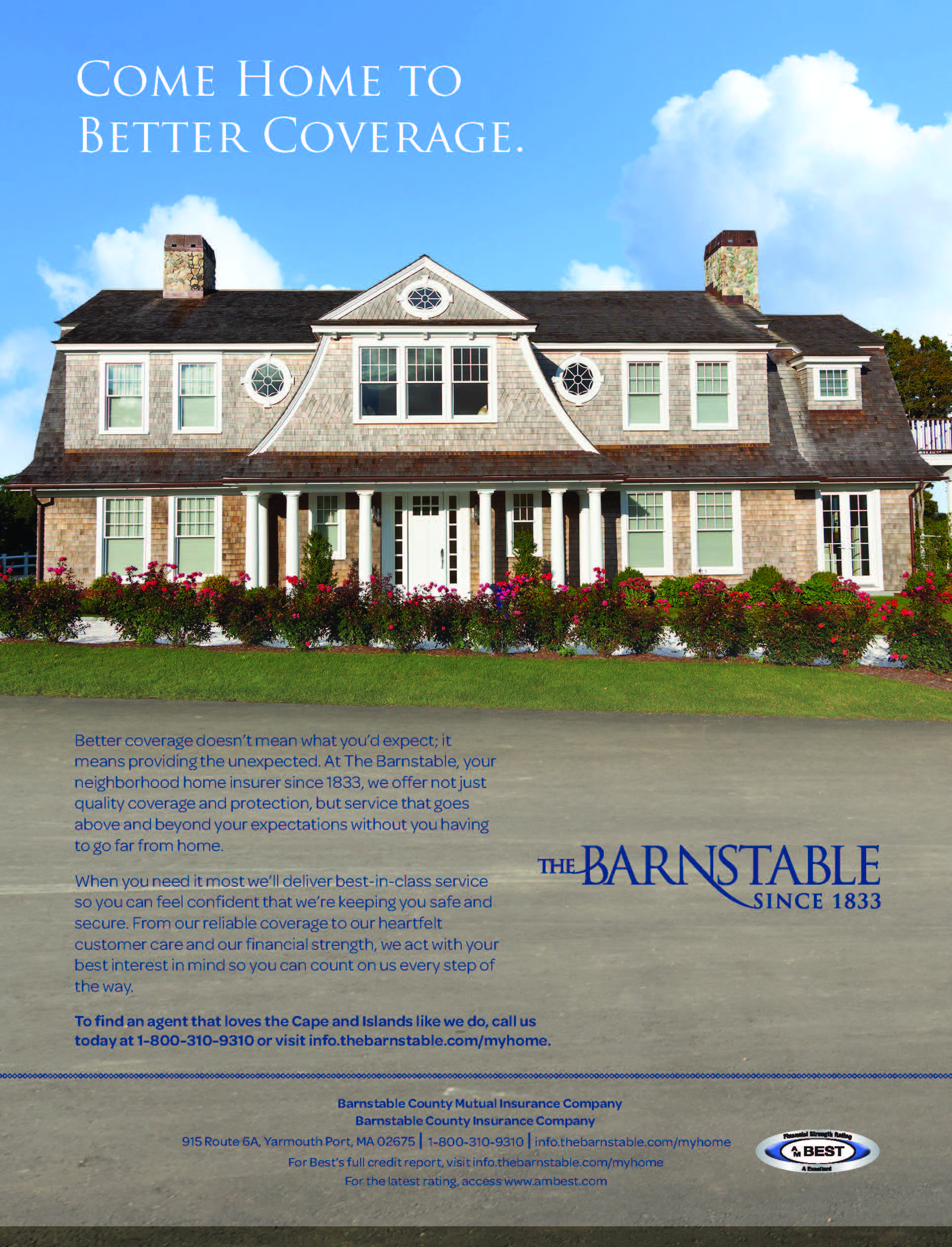
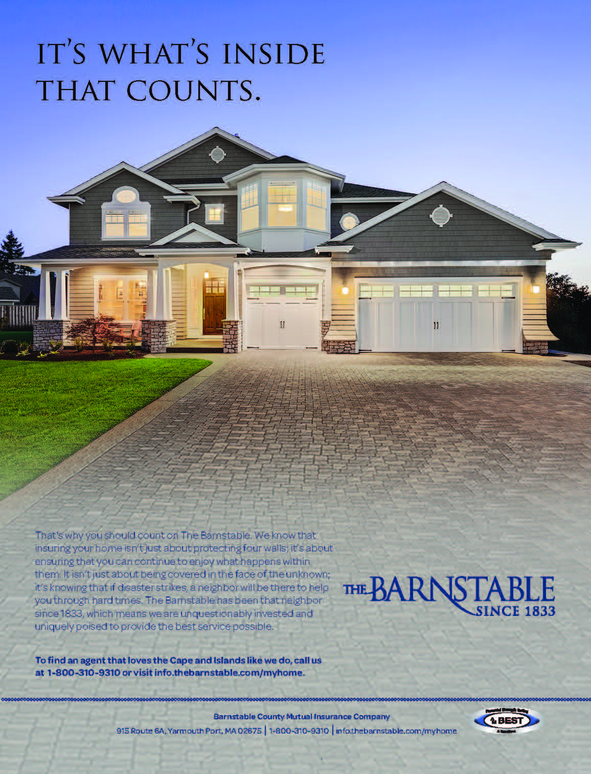
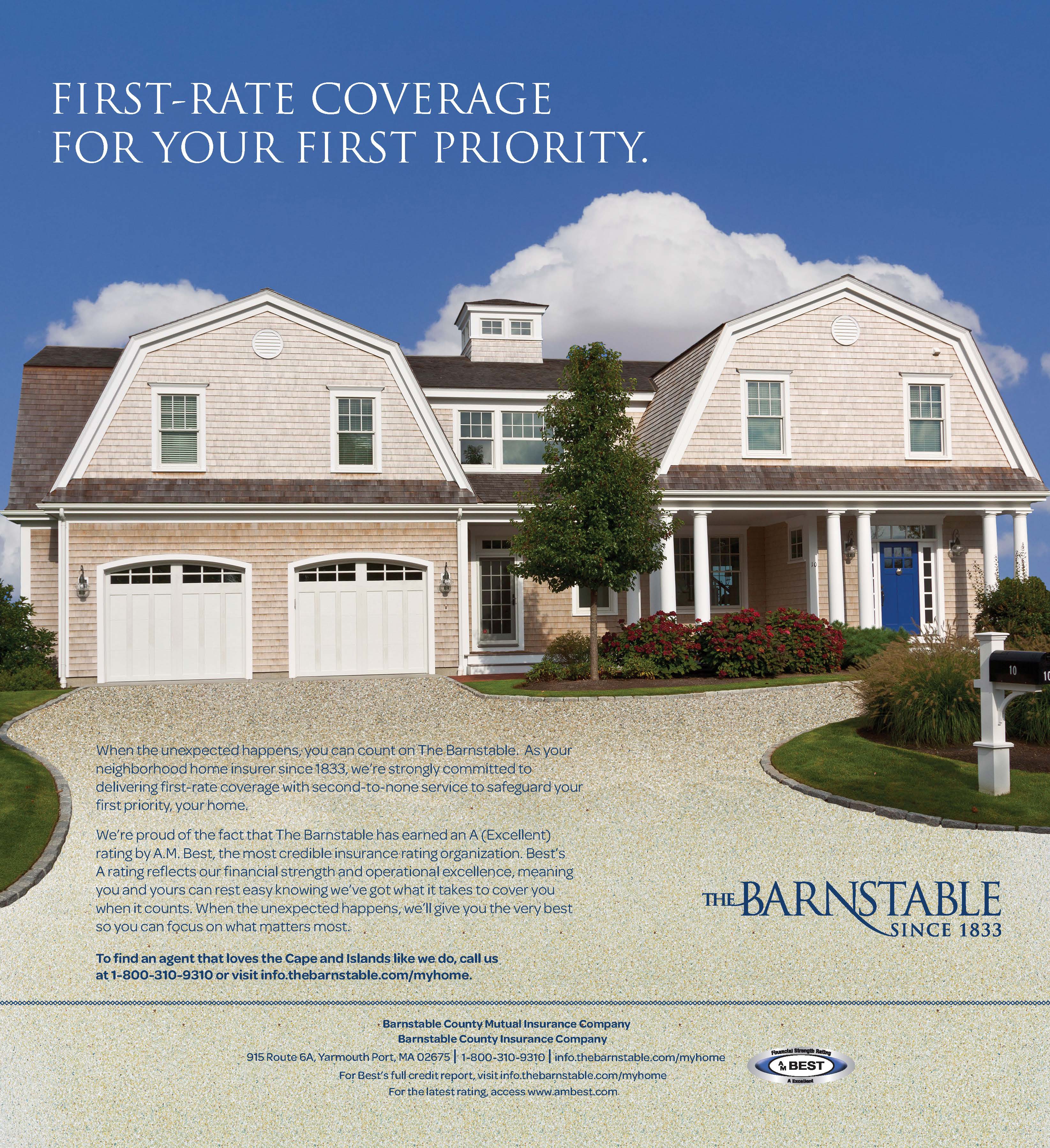
The first project in the campaign was to develop three print ads to be published monthly in the magazine Cape Cod Home and Cap Cod Life. The theme was homeowners insurance and I was charged with showcasing in the ad New England architecture setting in order to generate a more historical feel for these homes. In order to create these ads it required use of Photoshop to slice parts of other pictures in order to combine them into new finished products.

The print ads ran from April to June of 2016.
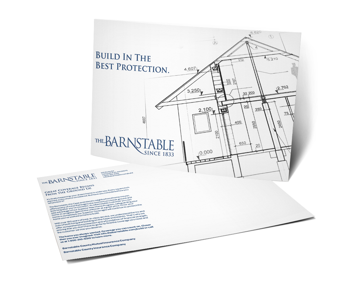
As well as using magazine ads for marketing The Barnstable also decided use of mailers would be needed as well. The theme for this campaign was home insurance so the use of houses both finished and architecture was important. For the mailer the team collaborated deciding on using a double sided mailer featuring a blueprint sketch for a home combined with text conveying message.

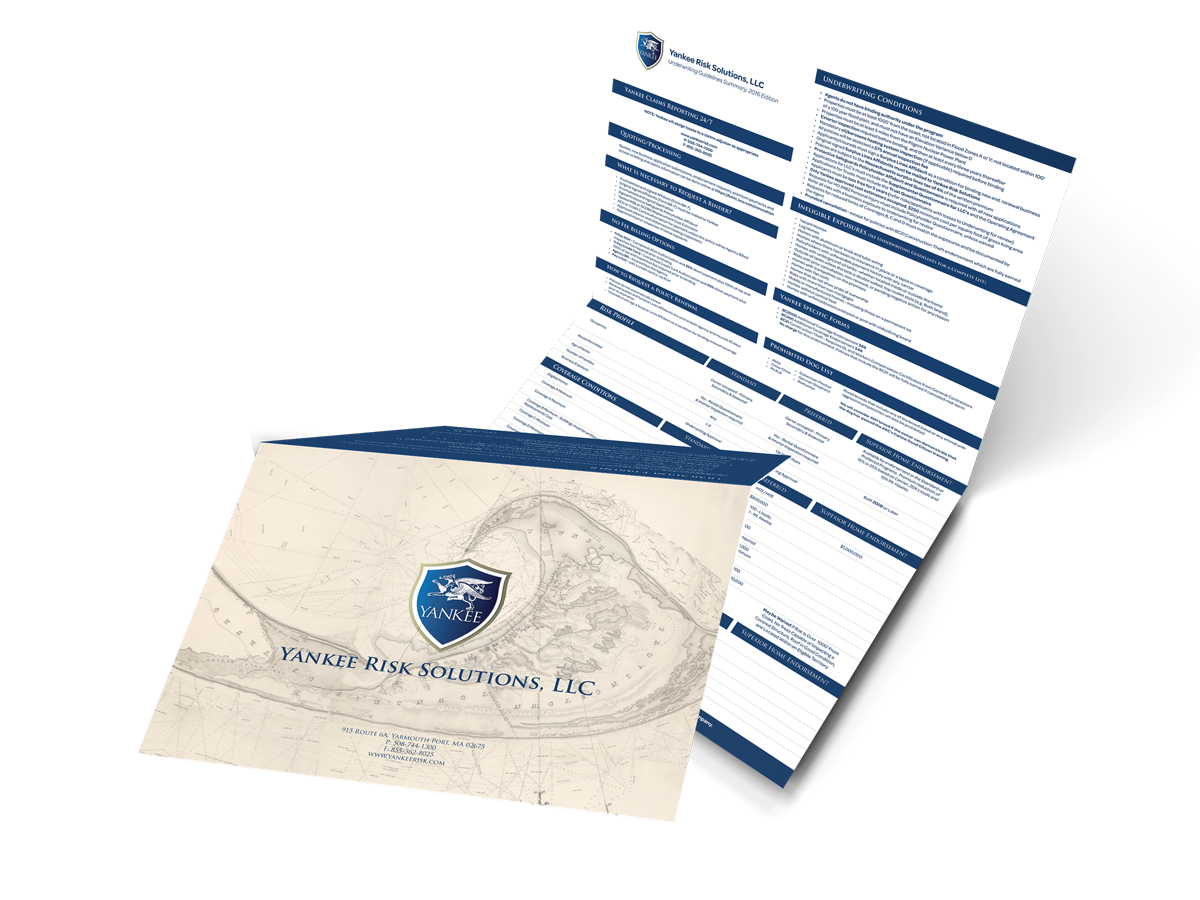
Mailers however weren’t the only mailed materials. The Barnstable sends its customers quick cheat sheet to better understand their policies. These are called the Underwriting Guidelines. These Underwriting Guidelines are brochures which in either a bifold or trifold format featuring a New England themed image, policy information and a letter from the owner.

These Underwriting Guidelines had to follow a historical theme to relate back to the location of Barnstable Massachusetts. This led to use of dark blue colors as well as incorporating historical image or New England styled homes in order to create a pleasant inviting tone.

Leave a Reply