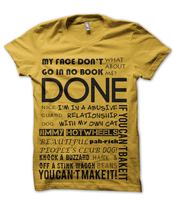


In my family, what sets us apart from each other are our catchphrases. Yes, we have catchphrases. However there is no person with more phrases than my Dad. When this project kicked off it was meant to a gift to poke fun at him but as I kept designing I had more and more fun playing with different fonts and placement.
Taking some of my Dad’s most popular catchphrases I placed them on a t-shirt template focusing on placement to fit as many phrases as possible. No phrases was ever the same so I didn’t want them to look the same. For every phrase I used a different font. When it came to picking which fonts for which phrases I used a bolder font for the more commonly used phrases. For example for phrases like “Done” it is said in such a demanding tone that I used one of the strongest and boldest fonts. Another is when you see “Beautiful People’s Club” is is displayed in a cursive resembling font as it would relate to country clubs using similar design.
When it came to picking the colors I wanted to use a two-tone color scheme using a very bright and dark color. In this case I went with yellow and black. I did this because I thought yellow was a rarely worn color so by using yellow it was eye catching when he wore it. The black colored phrases would then encourage people try and read the phrases on the shirt.